Monday, 3 February 2014
Planning Ancillary Products: Mock-up of Digipak
The slideshow above is the first mock-up I made when I was trying the images, fonts and layouts I thought would work best together. From this initial draft, I decided that the positioning of the copyright information (on the front of the digipak and inside), the positioning of the barcode and the content of the copyright information would be the features that I would keep for my final piece.
I then drafted a new plan based on feedback for my first draft and my new ideas for the superimposed image on the front cover and album name. I improved on my brick wall idea, and decided on a set tracklist. I also decided to move the design I originally had for the front, to the inside panels.
Planning Ancillary Products: Costume and Layout
Many dubstep artists have very simple clothing that are usually a t-shirt and pants, and perhaps an accessory that has become a part of their brand identity. In BL4KE's case, he wears variants of the same clothes as both the narrator and participant. This wasn't the original plan, but the white shirt, black tie and plain jeans work very well as his dubstep brand image, therefore I thought this would work well on the digipak.
Above is the mock-up of the way in which I aim to superimpose BL4KE's face onto the wall.
Slide 1 - First of all I will use a side profile shot of BL4KE and crop around the face.
Slide 2 - I will then begin to remove the surrounding areas of the picture around the face, up to the neck, and add a texture effect to give it the look of a brick wall.
Slide 3 - I will then remove the background of the wall image, and apply the face as an overlay on top of it, whilst reducing the opacity of the face so that both images are visible.
Slide 4 - The images will then be cropped together and matched up.
Slide 5 - Once this is done, another texture effect will be used to enhance the wall effect and colours.
However, when I began to work on a rough copy of the front of my digipak, I came with the idea of merging BL4KE's face with the iconic wall image of the man's face. This is for two reasons. Firstly, I liked the thought of visually portraying the fact that BL4KE is still an underground artist, therefore he is still invisible to people that have not knowledge of dubstep, and thus just a part of the scenery. I thought that an interpretation like this could be written in an inside booklet of the digipak, or perhaps on a bonus DVD explaining the making of the album. This would target fan bases such as the people I encountered on the Dubstep Forum website, who were angered deeply by commercial dubstep.
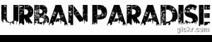
Secondly, I like the idea of showing that BL4KE is so "in-tune" with youth culture, that he is an iconic image in this "Urban Paradise". Carrying out this would mean his costume would not be visible.
Above is the mock-up of the way in which I aim to superimpose BL4KE's face onto the wall.
Slide 1 - First of all I will use a side profile shot of BL4KE and crop around the face.
Slide 2 - I will then begin to remove the surrounding areas of the picture around the face, up to the neck, and add a texture effect to give it the look of a brick wall.
Slide 3 - I will then remove the background of the wall image, and apply the face as an overlay on top of it, whilst reducing the opacity of the face so that both images are visible.
Slide 4 - The images will then be cropped together and matched up.
Slide 5 - Once this is done, another texture effect will be used to enhance the wall effect and colours.
Planning Ancillary Products: Album Name
Firstly, our video included as many negative stereotypes about teenage culture as it could. E.G:
- Drugs


- Alcohol

- Smoking

- "Sexual Behaviour"/ Promiscuity

- Staying out all night


- Violence

Together with this, he word urban is associated with young people and paradise can be thought of as your dream place to be. Therefore by showing all of this imagery and then labelling it as a "young person's paradise" it is insinuating that these negative stereotypes of youth culture is actually a dream scenario for a young person. It is supposed to be a sarcastic reflection on how we are portrayed in the media. Having said that, there is some truth in this, because as a young person, I know that many people around me glorify and glamourise things such as drugs and alcohol and violence, therefore it's also a statement about the mindset of some teenagers. this is then picked up by the media and projected as the general thought process of modern day teens.
My analysis of Chase and Status' digipak taught me that it only takes an image or word to make someone think of a stereotype, (e.g Dog - violence) Thus, on the surface, it is just a name designed with words to target the desired audience members, but below that, it is a controversial topic which I think many people enjoy to debate about. I also learned that many dubstep artist hide meanings in their music, digipak designs and symbols.
In many ways, our video glamourised these negative stereotypes of teenage culture, because even though the video was quite sad, we used visual elements and imagery such as the graffiti backgrounds to make it seem "cool" and enticing. As well as this, though lost and downtrodden, our main protagonist was still empowered at the end of the video by being the one to dictate when he walked away from the girl. In the cinema showing of our music video, this was the part that resonated the most with the target audience, which shows that they did not focus on the areas that showed the character in a bad light, rather his moments of power. For this reason, I thought that "Urban Paradise" was a fitting name for the album, as a sarcastic reflection of the portrayal and sometimes reality of youth culture.
Sunday, 2 February 2014
Planning Ancillary Products: Short List - Fonts
Earlier on in the course, when planning the synergy elements for our pitch, I designed a logo that could be used as BL4KE's official logo, as many artists usually have a signature design or font that is used on all they're products.


I have chosen this font to be used for the name of my artist, because the main reason I created this logo in the first place was so that it could be a reflection of the graffiti in our video. It is also to capture the urban theme so that it can transcend into all forms of my digipak. This font is also a perfect candidate, because it looks like graffiti, however it is still clear to read and can e easily recognised across the media products.
However, I do not think that this font is appropriate for use for the album name or tracklist. This is because it is legible as a large font, but the album name is smaller than the artist's name, and by convention, the tracklist is required to be much smaller than that, therefore as a much smaller font, the "spray-effect" won't be easy to read. Thus my short list for the album name and tracklist are narrowed down to:
1) This is a possible choice because it is classic bubble writing, which is a common style of writing used in graffiti. This means that it will easily be recognisable amongst the audience members as a graffiti font which matches the graffiti font of the artist's name. This font is also easy to read as it is clear.
2) This is a second choice, because although it is not a typical graffiti design, it is simplistic, which means it will compliment the font used for the name of the artist, which is an important rule on the Dos and Don't of design work. It is also easy to read, and will still be easy to read when made into a smaller size.
3) This is my third choice. This is because, it has the effect as though it is graffiti that has been on the wall for a long time. it is also clear enough to be legible when translated into a smaller size, and the detailing at the bottom makes it interesting. On a black background, it is clearer to see that the bottom of the letters are made to look like towers and buildings.
Planning Ancillary Products: Do's and Don'ts of Design Work
1) DO!
The first rule of design work in relation to fonts is to make sure that only a maximum of two fonts are used. This is because more than two fonts will make the ancillary products look unprofessional. Two many different fonts may also contradict each other a distract the audience from the important features of the digipak. The fonts must also complement each other so that it doesn't look mis-matched, and in terms of my dubstep genre, I hope to use fonts that look either like graffiti or electronic/digital. The sizing of the fonts also matter, for example the following of the convention of a larger font size for the artist's name and smaller font size for the album name. Fonts should also never be used purely because they look"pretty".


.jpg)

The first rule of design work in relation to fonts is to make sure that only a maximum of two fonts are used. This is because more than two fonts will make the ancillary products look unprofessional. Two many different fonts may also contradict each other a distract the audience from the important features of the digipak. The fonts must also complement each other so that it doesn't look mis-matched, and in terms of my dubstep genre, I hope to use fonts that look either like graffiti or electronic/digital. The sizing of the fonts also matter, for example the following of the convention of a larger font size for the artist's name and smaller font size for the album name. Fonts should also never be used purely because they look"pretty".
2) DON'T!
The use of unnecessary effects may lead to the ancillary products looking nothing like the original concept. For example, a picture with a "plastic wrap" filter on it may end up looking distorted and disproportionate, when it was originally supposed to be a soft image of the artist's face for the cover of a romance CD. In my case, overuse of a filter may lead to the iconic image I choose looking distorted because of the different colours in the graffiti. When using an effect, it must suit the genre.
3) DO!
I have already been focusing on the rule of sticking to three
colours as a maximum. This is why my blog on my short list of colours and images only feature three colour choices each to accompany the pictures. minimising the amount of colours means that they are most likely to go together well, and a more focused approach means it will also most likely fit the genre correctly as well as the colours in the
photos.
4) DON'T!
Another "DON'T" is the stretching of images to fit the panel of the digipak template. This is because, stretched images can look distorted and unnatural. It can also be easily identified as a stretched image. If an image needs to be made bigger, then the size should be changed and any areas the are not needed should be erased. Images that are stretched reduce the amount of marks that can be allocated to the ancillary products.
5) DO!
Using clear photos that are in focus are essential, because they make sure the digipak looks professional and shows that you took the time to photograph the artist for the ancillary work. Also, on this subject, text should never be placed on or across the artist's face, and the rule of thirds should e followed to aid composition.
6) DON'T!
Pictures on every
panel are distracting and make the digipak look as though there was no specific concept. To avoid this, I have carried out research to follow the conventions of the dubstep genre closely, as too many photos in order to fill up space will
lose marks.
7) DO!
The media products should include:
- Barcode
- Date
- Copyright information
- Title of the album
- Artist name
- Record company logo
- Website
- Artist website.
for authenticity.
Planning Ancillary Products: Short List - Image and Colour Scheme

I have decided that I want to use some type of iconic imagery from the video to create the design of my digipak. Therefore an image similar to this is the first on my short list. This is because this location is used as a reoccurring image in our music video, to show that the artist is lost and aimlessly walking through life. As it is an image that is repeated, the audience are more likely to remember it, and if I use it, the colour scheme accompanying it must suit it, not contradict. Thus, the colour scheme would be orange, pink and green.

This is another memorable image from the music video. This is because there is a whole 3-4 seconds of the music video that is devoted to the camera trailing up this wall and reaching the sign at the top. The sign again sets the tone of the video, by enforcing the feeling of hopelessness and being lost. Therefore, having this featured in the ancillary, will set the same theme across the other media products. Of course, the colours to accompany this would be the dark orange, white, and black.

There are not many images in our video that feature this background, however, this base track is at the very beginning of our video, and thus one of the first images our audiences are confronted with. Therefore it still contains an element of synergy and in previews of the video, where this beginning scene is the only section that is shown, this image will me the most prominent. Thus it is a good candidate for the digipak. Also, the colours with this image would be, blue, black and a peach hue/ orange.
OBSERVATIONS:
From my final short list of choices of images and the accompanying colour scheme, it can be seen than although in different hues, the colour orange is present many times, as well as black. Therefore I think I can already deduce that BLACK and ORANGE will definitely feature in my ancillary work. Although the type of orange is still to be debated.
Subscribe to:
Comments (Atom)