Friday, 20 December 2013

RESEARCH ANCILLARY: Font Research

I believe i will be using a technique to letter press my font into my digipak

Letter pressing will hopefully give me a professional yet mysterious look, because of the nature of my genre i will be adding filters and making it look somewhat vintage to ensure i get a distorted and abandoned feel throughout my production, similar to my music videos locations.


UPDATED: To give a letter press feel, i used innershadow to give it the embeded feel as bevel and emboss did not work

Researching Ancillary Products: Feedback for Pitching Ancillary Products


Feedback from my Pitch was overall good although I had many improvements to make on the advert.

+My digipak design was described as unique and the theme of the product supports the   genre and who the artist represents. 

+My Advert was described in 5 words as unique, urban, dark, masculine and moody
I was advised to add more selling points for the artist in the advert products like 5 star ratings, tour dates, availability on iTunes and website information

Thursday, 19 December 2013

RESARCH ANCILLARY: Inspiration from artists

My Digipaks have been inspired by a few artists, images will be sown below.


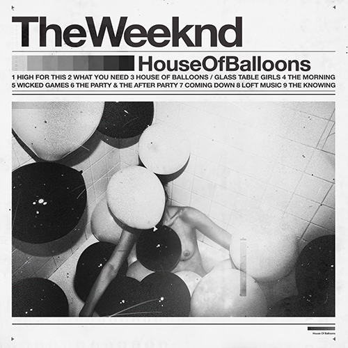
the house of balloons one has a very discrete font and colour scheme which i will adopt, whereas the james blake cover is how i will have my artist at this current stage but with less of an effect on his face, the combination of these two will hopefully give me a strong digipak and drafts will be posted during the christmas break


RESARCH ANCILLARY: What magazines will my advert feature in?

After being asked what magazine my advert will be placed on i had to have a quick research session as no dub step/urban magazines came to mind.

Music magazine wise, i found two websites which have a dubstep feature.


However, my magazine advert will also be placed in urban magazines for big cities with an underground culture, so for example in england it would be a magazine based around east london.

Dubstep and new genres which create a buzz tend to be done mainly over social media and the internet, but the more commercial dubstep (which our song is) can be advertised by many magazines, even such as NME and GQ because of its sudden surge of popularity.

RESEARCHING ACILLARY: My mockup (Practise)


In terms of conventions, these two front panels have everything you will see in mainstream artists' covers.

An Artist name, spine, album title, logos on the back, track listing.

However, the artists name is not obvious and this can be a deception for the target audience. the colour scheme is also feels out of place and the spine is not clearly defined as a separate entity in comparison to the two completely contrasting panels.

--inside panels to be posted--

RESARCH ANCILLARY: Features of my digipak

My Digipak will consist of

- 4 Panels
- A grayscale colour scheme
- Simplicity yet mysterious
- A picture of my artist(to conform to conventions)
- Distorted
- Embossed Text


I decided for these features after initially wanting something bright and abstract but then after some thought my music video itself is very distorted and mysterious and by making my digipak a similar way i could ensure i was creating synergy between my productions


Drawings of my initial idea will be posted here

RESARCH ANCILLARY: Non Conventional entry into the music industry/DIGIPAK


Blog about The Weeknd and his non-conventional entrance into the music industry.


What we have learned in media is that when a new artist is trying to break into the music industry they do as many interviews, guest appearances and basically give it all up just to have one song in the charts, many of these artists who are pushed by their record labels don’t last that long, such as artists from x factor only make it so far. The weeknd has reached massive heights independently and took the music industry by surprise.

In 2011, Abel Tesfaye (the weeknd) released an album on the internet (forums etc) called ‘House of Balloons’ this album was released for free and nobody had any idea of the real identity behind this stage name.


The house of balloons album cover/digipak only had the artists name and album title, you could tell it’s the artists name as its bolder and font size is bigger than others. Subsequently the album title is smaller and then the songs are even smaller. The colour theme is conventionally the same, around 3-4 different shades of colour, which fit perfectly well together; the colour scale is also present below the artists name.


Abel Tesfaye also released two more albums that same year (2011) both were also available for free download on his website and other social media.

Next thing you know is that everybody is talking about this mysterious artist, he later revealed that many labels contacted him early on for a record deal and that many music magazines and radios wanted to interview him, he only recently gave an interview in 2013 despite being on the scene since mid 2011.
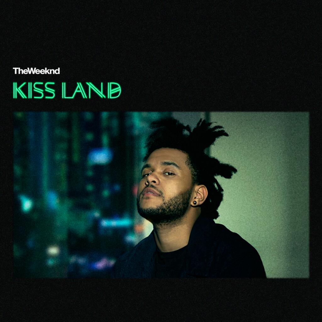
He has since sold out the O2 Arena in November 2013 with his new album ‘Kiss Land’

Friday, 13 December 2013

Researching Ancillary Products: Mock-up of Digipak


My mock-up of my digipak


Researching Ancillary Products: The Do's and Don't's of Design Work


Here are some rules I need to follow in order to produce a good piece of ancillary work.


Stick to TWO clear fonts

Stick to THREE colours maximum, and make sure they fit in with the genre correctly. 

Make sure photos are CLEAR

Follow the rule of Thirds for composition

Include elements such as Bar codes, copyright information, title of album ad etc


Avoid using unnecessary effects

Try not to have images that are really stretched out 

Do not place text across the face of the Artists


Researching Ancillary Products: My Practice of a Digipak


I had a practice run of making a digipak in class just to get the idea of making the finally album for my artist and to familiarise myself with using photoshop.


Researching Ancillary Products: Magazine Adverts (Inspiration)


Researching Ancillary products: Analysis of Digipaks from my Genre


I analysed a digipak classed in the Dubstep Genre,.

The first was Krewella - Get wet
-The animation work on the album cover is very effective due to the dark and vibrant colours being used
-The font on the band name and album name fits in well with the background
- They have stuck to the 'Get wet' theme of the album through making reference to water in the animated work and font.


Wednesday, 11 December 2013

Researching Ancllary Products: The Importance and Function of Digipaks


What is a Digipak?
Digipaks are a modern approach to CD/DVD packaging and is the album and includes the album and advertisemnt in which the artist current music videos and material.

Digipaks are important because the artist\band shares their music, promotes the artist,create a fan base and increases the number of CD sales. Advertisement and other aspects of digipaks show preparation for the official album release date which updates fan. 

Elements to include:
- Image of artist/band 
- Artist name
- Album name
- record label
- Web address 
- Bar code
- Promotional information and maybe sticker 

Here's examples of a digipak...


Researching Ancillary Products: Album Covers (Inspiration)


Researching Ancillary Products: Practice Album Cover

 unfinished

Research Ancillary Products: My Digipak form Last Summer


Analysing my digipak from last summer I've realised my product was very unprofessional. Recently I've learnt key things i must incorporate in order to have that professional look and avoid an amateur look.

Weaknesses ...
- There are different fonts which looks confusing 
- There is over four colours of font
- The filter on the back cover and front are to different ones
-The font looks similar to handwriting

Strengths ...
-The front cover has a matching scheme 
-The picture of the artist doesn't look stretched out  

Monday, 9 December 2013

RESEARCH ANCILLARY: Analysis of three digipaks and three advertisements

-- have not finished my blog post on this as i am making a very detailed blog based on this task with contrasting my genre and a new artist who has blown and took the music industry by suprise--
 
will be on here 12/12/13

Friday, 29 November 2013

PRODUCTION: Pros and Cons while working on my Music Video (GENERAL)

In this blog post i will be talking about the things i liked and was not particularly fond of.


Pros:
Media Department
- the ability to have take out the cameras whenever wanted
- the availability of the workshops
- the tremendous amount of support given when needed

Filming/Editing
- The freedom to be as creative as possible because of music videos not having to make sense - 'disjuncture'
- Bringing in many editing techniques and creating a motif to talk about throughout my A2 Project

Cons:
Slightly different editing styles within our group

PRODUCTION: Skills Development

I have learned a few new editing techniques while editing my video, mainly the use of filters which i did not include so much in my AS work. Filters were essential in the music video, its almost electronic make up, however it also makes it look professional.

We also used 'smooth cam' to clear any rough clips and tidy them up, this process took over an hour to render but it was worth it and you can really see the change, this i did not use in AS and i wish i knew about it before.

As my thriller was cross cutting between two continuous scenes i did have many static shots and did not have to use the stop/start effect which is present in my music video, but i believe learning this reverse clip technique can help me with many productions as its very simple yet so effective when trying to find a link between the clip and the beat of the song.

I have developed my slow motion skills further, by not only using the slow motion but syncing it well so that it was visually attractive and used at the right time, and also not overused.


--pictures to be added

Production of Music Video: Progress Review Blog

Over the research, planning and construction stages of the music video, I feel like I have blogged about vital details throughout, and these details have aided my progress throughout this section of the course. However, I do think that the posts could have been more frequent and perhaps on the day rather than waiting a few days before posting. Despite this, I was still able to look back on my blog posts and think about what to improve, whether that be on the posts itself or the subject I was blogging about. Therefore, I am quite happy with how my blogging work has developed so far, and in relation to the targets I have set myself, I have accomplished my targets to include a greater range of digital technology and blog in more detail. For the Ancillary blogs I hope to improve further by blogging more consistently and  a higher standard of digital technology. I also thought more creatively about extra blogs that I could write about that was of value to this project.


PRODUCTION: The checking off, a show by Can Arslan

Ticking off a piece of paper has never felt this good!


After stressful periods during filming, i am happy that we have finished our production and i am pleased with it.

PRODUCTION: Rough cut reflection

Our rough cut is pretty different from our final production(phew).

Main feedback from rough cut

- Basetrack too long
- Use filters
- More effects such as overdrive(which was used)
- let the artist finish a word before cutting to the next clip\

We addressed all these issues and they helped our final production become much stronger, especially the 'letting the artist finish a word' which we then realised had a major effect on the strong audience connection and breaking the fourth wall

Production of Music Video: Progress Review Blog

Overall I feel that I’ve blogged well as I’ve posted in detail about all the essentials stages in which it took to make this project come to life. Though I feel I’ve completed my blogs thus far at a decent level, I do think I’d have been better if I’d blogged more frequently and also in the correct order, therefore making it easier to go back and re-read my work in order to make sense of it when reflecting on my progress.


Although I feel I’ve begun to reach my previous target of using more media technology when blogging, I still feel I have to use more in order for my blogs to be a little more interesting. I hope to achieve these goals when blogging about my Ancillary Project. 

Production of Music Video: Skills Development

In terms of our approach to this project, I feel that my group and I took time out and planned the concept of our music video in detail, compared to my group last year when making our thriller opening were we'd been extremely ambition and inconsiderate of timing and our facilities. As a result, we were more successful in achieving our long term goals.

As we went through the procedure of creating our music video, we all contributed by sharing our ideas and discussing them thoroughly, remembering to consider our target audience and the genre of our music video as we did so. Doing this allowed us to really take charge and be independent learners as we worked our way through all our shortcomings, finding solutions as a group.

Production of Music Video: Skills Development Progression from AS


This year I feel I have progressed further in terms of my editing skills when aiming to piece together our music video. A way in which I believe I've achieved this is the fact that I for one, picked up on a technique which allowed me to add and adjust filters to several clips simultaneously, whereas in AS, I had done each clip individually which proved to be time consuming. Within the process of exploring this method, I also learnt how to use a range of new features such as Desaturation, Sooth Cam and _________, all which helped bring the video to life along with making it look more professional.


PRODUCTION: Editing of music video!

I personally did not have a large role within editing our music video as the times my group were free to edit i had lesson, which was a major change for me working with four people because in my AS year i only worked with one person and i was in charge of the whole editing process, however i made it to most of the editing sessions to give in my input and ensure i have a say within our final production. Never the less, i managed to learn some new editing skills which will be presented in a separate blog.

In this blog i will be showcasing our timeline and various effects used.


The screenshot below demonstrates two clips being reversed and then put in normal order and multiplied a few times in order to get a stop/start effect, but when this is used effectively with good content, which in our case was the smashing of glass. It ensured that the target audience was still engaged as it was repeated a few times at fast paced, as a result of the repetition instead of one single break, the audience could also see the glass pieces.
The grey clips before the below ones show the transition we used in order to get into these clips, transitions are effective because it makes the sequence look much smoother rather than skip from clip to clip with no real indication to indicate the next clip is something different.

The clip below demonstrates the stop and start effect we used consistently throughout, however we did not use it too little or too much, i believe it has been used sufficiently. This edit of ours is a motif within our productions and i believe i can use this to my advantage when creating my ancillary products.(which is a secret until ancillary blogging begins!)

The screenshot below portrays our base tracks and how they have been positioned to sync when the artist(me:) says the word 'take' doing this was essential and the best way to make sure it stays in sync throughout.


 This screenshot below shows us adding video filters, in this clip we used the desaturation filter to give us a distorted effect and remove some of the bright colours present, this can once again be used to my advantage when making my ancillary products, this distorted feel seems to be the theme that i will be going with.

When you apply the desaturation effect, you alter the settings which is on the left to what satisfy your needs, and we found the perfect settings which matched our vision.

Here is a small amount of the markers used, i believe the use of markers was good in terms of short term (5 minutes) but after coming back onto the editing sometimes you forget what the marker was there for. i was not a fan of using markers in this term but my group went ahead with it.

 Colour correction after blacking out the rest of the clip and only allowing a certain shade of red/purple
Doing this effect via video filters helps us sync the lyric 'never should of listened to the serpent' with the clip of the serpent, and the video filter ensures the target audience concentrates on this.

 The clip below once again shows use of the stop and start effect, however this time used rapidly as you can see from the amount and length of the clips.

 The clips below and and above represent a transition which we was really proud of, the clip below has a distorted filter to it, and as its towards the end of the base track and we wanted the kill the base track with a bang, we used the filter 'overdrive' on the clip below to give the clip a shake, as if the camera was being shoved away when being pushed away. The dark devilish red also helps portray a sense of ending


Thursday, 28 November 2013

Production for Music Video: Skills Development (New Editing Skills)

Editing the Music Video has taught me new editing skills and techniques that either produce effects that I could not produce in AS, or create the same desired effect but in a less time consuming way. For example, the image below shows how I used the controls in the motion section to desaturate the low tones in order to enhance the overall filter. In AS I was new to these features, therefore if I was to add an effect I would have probably gone for softer effects instead of the harsher ones so that I did not have to adjusted them to a great extent and risk ruining the project. Also, I realised that using the controls over the clips was the easiest way to adjust the clips.


The image below is another example of how I enhanced my editing skills by finding faster methods of editing, but achieving the same result. I learned this year how to add an adjusted filter to multiple clips at the same time, instead of adding the effect to each clip individually and then adjusting each clip to the same percentage. This allowed me to desaturate all the narrative footage to 74% at the same time, which then meant I had time to focus on effects that require more attention and detail, like the Gausian Blur at the beginning of the video.


I also experimented with effects such as SmoothCam. As the beginning of our video starts with the camera trailing up a graffitied wall, we tried to use SmoothCam to make this movement as smooth as possible. Even though we were advised not to use SmoothCam in the end because our footage did not need it, I still think this was valuable because I learnt about what more of the filters could do to the footage. Therefore next time I use Final Cut Pro, I will have a better idea of what each filter can do and thus can plan what possible filters to use from the very beginning.