Thursday, 19 December 2013
RESEARCHING ACILLARY: My mockup (Practise)
In terms of conventions, these two front panels have everything you will see in mainstream artists' covers.
An Artist name, spine, album title, logos on the back, track listing.
However, the artists name is not obvious and this can be a deception for the target audience. the colour scheme is also feels out of place and the spine is not clearly defined as a separate entity in comparison to the two completely contrasting panels.
--inside panels to be posted--
RESARCH ANCILLARY: Features of my digipak
My Digipak will consist of
- 4 Panels
- A grayscale colour scheme
- Simplicity yet mysterious
- A picture of my artist(to conform to conventions)
- Distorted
- Embossed Text
I decided for these features after initially wanting something bright and abstract but then after some thought my music video itself is very distorted and mysterious and by making my digipak a similar way i could ensure i was creating synergy between my productions
Drawings of my initial idea will be posted here
RESARCH ANCILLARY: Non Conventional entry into the music industry/DIGIPAK
Blog about The Weeknd and his non-conventional entrance into
the music industry.
What we have learned in media is that when a new artist is
trying to break into the music industry they do as many interviews, guest
appearances and basically give it all up just to have one song in the charts,
many of these artists who are pushed by their record labels don’t last that
long, such as artists from x factor only make it so far. The weeknd has reached
massive heights independently and took the music industry by surprise.
In 2011, Abel Tesfaye (the weeknd) released an album on the
internet (forums etc) called ‘House of Balloons’ this album was released for
free and nobody had any idea of the real identity behind this stage name.
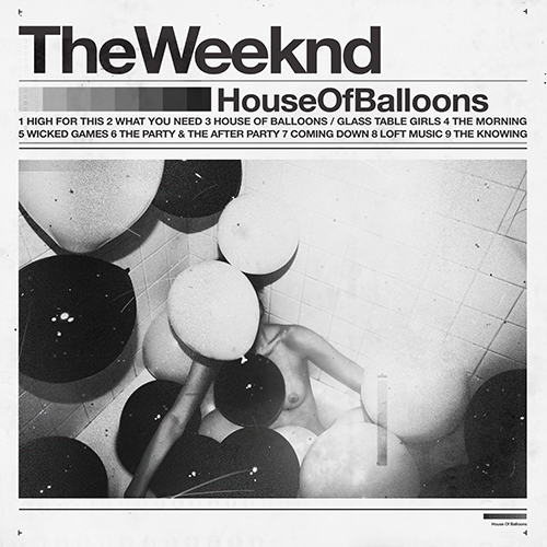
The house of balloons album cover/digipak only had the
artists name and album title, you could tell it’s the artists name as its
bolder and font size is bigger than others. Subsequently the album title is
smaller and then the songs are even smaller. The colour theme is conventionally
the same, around 3-4 different shades of colour, which fit perfectly well
together; the colour scale is also present below the artists name.
Abel Tesfaye also released two more albums that same year
(2011) both were also available for free download on his website and other
social media.
Next thing you know is that everybody is talking about this
mysterious artist, he later revealed that many labels contacted him early on
for a record deal and that many music magazines and radios wanted to interview
him, he only recently gave an interview in 2013 despite being on the scene
since mid 2011.
He has since sold out the O2 Arena in November 2013 with his
new album ‘Kiss Land’
Wednesday, 18 December 2013
Friday, 13 December 2013
Researching Ancillary Products: The Do's and Don't's of Design Work
Here are some rules I need to follow in order to produce a good piece of ancillary work.
Stick to TWO clear fonts
Stick to THREE colours maximum, and make sure they fit in with the genre correctly.
Make sure photos are CLEAR
Follow the rule of Thirds for composition
Include elements such as Bar codes, copyright information, title of album ad etc
Avoid using unnecessary effects
Try not to have images that are really stretched out
Do not place text across the face of the Artists
Researching Ancillary Products: My Practice of a Digipak
I had a practice run of making a digipak in class just to get the idea of making the finally album for my artist and to familiarise myself with using photoshop.
Subscribe to:
Posts (Atom)